

Subscribe to RSS
DOI: 10.1055/a-2402-5832
“It Attracts Your Eyes and Brain”: Refining Visualizations for Shared Decision-Making with Heart Failure Patients
Authors
Funding P.G. is supported by National Institute on Aging grants K76AG064428 and R21AG077092. P.G. was a member of the Junior Investigator Intensive Program of the U.S. Deprescribing Research Network and is supported by a U.S. Deprescribing Research Pilot Grant, which are funded by the National Institute on Aging (R24AG064025). S.M. is supported by the National Institute of Nursing Research (T32 NR016913).

Abstract
Background N-of-1 trials have emerged as a personalized approach to patient-centered care, where patients can compare evidence-based treatments using their own data. However, little is known about optimal methods to present individual-level data from medication-related N-of-1 trials to patients to promote decision-making.
Objectives We conducted qualitative interviews with patients with heart failure with preserved ejection fraction undergoing N-of-1 trials to iterate, refine, and optimize a patient-facing data visualization tool for displaying the results of N-of-1 medication trials. The goal of optimizing this tool was to promote patients' understanding of their individual health information and to ultimately facilitate shared decision-making about continuing or discontinuing their medication.
Methods We conducted 32 semistructured qualitative interviews with 9 participants over the course of their participation in N-of-1 trials. The N-of-1 trials were conducted to facilitate a comparison of continuing versus discontinuing a β-blocker. Interviews were conducted in person or over the phone after each treatment period to evaluate participant perspectives on a data visualization tool prototype. Data were coded using directed content analysis by two independent reviewers and included a third reviewer to reach a consensus when needed. Major themes were extracted and iteratively incorporated into the patient-facing data visualization tool.
Results Nine participants provided feedback on how their data were displayed in the visualization tool. After qualitative analysis, three major themes emerged that informed our final interface. Participants preferred: (1) clearly stated individual symptom scores, (2) a reference image with labels to guide their interpretation of symptom information, and (3) qualitative language over numbers alone conveying the meaning of changes in their scores (e.g., better, worse).
Conclusion Feedback informed the design of a patient-facing data visualization tool for medication-related N-of-1 trials. Future work should include usability and comprehension testing of this interface on a larger scale.
Background and Significance
Patient engagement in medical care is a growing priority. With mandates such as Open Notes and the Information Blocking Rule, technology-integrated care and providing access to health data have become important mechanisms to improve patient engagement.[1] [2] [3] Alongside these mandates, now more than ever, health research participants and patients want to see their health data returned to them and want to play an active role in their health decision-making.[4] [5] [6]
However, the integration of patient engagement and shared decision-making processes in clinical practice has been slow due to a lack of multilevel support and inadequate guidance on the steps and materials needed to effectively engage patients with their health data.[7] [8] As a result, if data are returned at all, it is often provided in generic formats that are difficult to interpret. For example, health results in the form of graphs and statistical terminology (e.g., T-scores) require high graph literacy, numeracy, and health literacy levels to understand.[9] Complex health data (such as patient-reported outcome data) that are not designed for the average patient to interpret pose a major barrier to engagement and agency in decision-making.
Prior research has shown that using visual analogies and meaningful visualizations can help patients and health research participants understand, engage with, and act on a variety of health conditions such as asthma, HIV, pain, and infectious diseases.[10] [11] [12] [13] [14] Additionally, data visualization tools have helped patients with heart failure (HF) understand their trajectory of self-reported symptoms like fatigue over time.[15] This supports the promise of visualization tools to help patients and research participants understand the effect of various interventions (such as medication changes) on their self-reported symptoms.
N-of-1 trials have recently emerged as a personalized trial format to help patients understand the effects of medical interventions. N-of-1 trials can be used to compare the effects of an intervention or treatment within a single participant and give participants an opportunity to compare their own responses to different treatments. This experience can give patients the confidence to engage in shared decision-making about medications.[16] [17] [18]
The personalized format of N-of-1 trials provides a valuable opportunity to integrate a data visualization tool to help participants determine how specific medications make them feel. Further, although existing guidelines encourage data sharing and collaboration between patients and clinicians, there is no clear guidance on the optimal way to present data to patients/health research participants to support decision-making between treatments in N-of-1 trials.[19] [20] There is substantial variability in the way that data have been shared with participants in prior N-of-1 trials, including the use of line graphs, bar graphs, scatter plots, and icon arrays.[16] [21] [22] [23] [24] [25] According to two systematic reviews of patient-facing health data, prior research considers the use of color to display risk and incorporates graphs and/or icons to display data.[13] [14] Due to the wide range of populations and conditions included, these reviews emphasize the importance of designing and testing visualizations with target audiences to determine the most effective displays for the purpose of the tool. In prior work evaluating comprehension and preference of symptom data visualizations among HF patients, visual analogies were more highly comprehended compared with bar graphs, number lines, and line graphs.[9] For N-of-1 trials to effectively achieve the objective of patient engagement in medication decision-making, there is an urgent need to develop effective, comprehensible data visualization tools that align with closely with target audience needs and preferences.
Objectives
In this study, we evaluated and refined a data visualization tool that includes visual analogies and optional graphs to return health data results to patient participants in N-of-1 medication trials. We conducted our study among individuals with heart failure with preserved ejection fraction (HFpEF)—a condition well-suited for developing a symptom-based data visualization tool given its association with low quality of life and high burden of symptoms.[26] [27]
Methods
Study Description
This study was conducted from April 2021 to February 2023 within the context of a pilot study of N-of-1 trials for deprescribing β-blockers in HFpEF.[18] [28] Demographic data (i.e., age, gender, ethnicity, education) were collected, as well as validated measures of health literacy,[29] subjective numeracy,[30] and graph literacy[31] to contextualize participant perspectives on visualizations. Patient-reported outcomes (PROs) were collected while the participant took their β-blocker (On), and then again after the participant stopped their β-blocker (Off). Two validated PRO measures were collected. The first measure was the 12-item Kansas City Cardiomyopathy Questionnaire (KCCQ-12)[32] [33] which measures four domains of health status including functional limitations, social limitations, quality of life, and symptom frequency on a 0 to 100 scale. These scores can be summarized in an overall summary score. The second measure was the 29-item Patient-Reported Outcomes Measurement Information System (PROMIS®-29)[34] profile which measures mental and physical health domains including anxiety, fatigue, and physical functioning. Health domains (e.g., fatigue, pain) are scored individually, with higher scores indicating more of a domain. The KCCQ-12 and PROMIS-29 were chosen because they capture symptoms that are frequently experienced by adults with HF, and because they are widely used and recommended for use in research on patient-reported health status.[35] [36] [37]
Data were ascertained through PRO symptom surveys administered remotely—every week for the PROMIS-29 surveys and every 2 weeks for KCCQ-12 surveys; and then again at periodic study visits every time the participant was on or off their medication (every 4–6 weeks, depending on the participant's medication dose and related titration schedule). Summaries of the PRO data were presented to participants at scheduled study visits using a web-based data visualization prototype developed based on prior research[9] [38] that is optimized for viewing on desktop, tablet, and mobile formats. The main format of representing data is a visual analogy (gauge) which, as found in a prior study presenting health data to HF patients, was highly preferred and comprehended when compared with a line graph, number line, and text-only formats.[9] The purpose of the visualization was to facilitate a comparison of PROs while on versus off β-blocker and to facilitate a discussion and decision-making about continuing versus discontinuing their β-blocker. This prototype was iterated throughout the study based on participant feedback in qualitative interviews. At the conclusion of the N-of-1 trials, participants were asked to decide whether they wished to stay on or discontinue their β-blocker.
A key objective of the pilot study was to iteratively refine a protocol for conducting N-of-1 trials to facilitate the deprescribing of β-blockers among individuals with HFpEF. Qualitative interviews were conducted at multiple time points to understand participant perspectives on various aspects of the study and to guide protocol iterations to maximize feasibility and acceptability. Multiple interviews were conducted with each participant who participated in the Pilot Deprescribing N-of-1 Trials for Beta-blockers in the HFpEF study (N = 9).[28] Another key objective of the pilot study was to measure decision-making measures, including shared decision-making, patient activation, and decisional conflict, which will be reported in future publications, alongside the other quantitative and clinical outcomes measures. In this manuscript, we report results from the qualitative interviews specific to the data visualization prototype and describe the subsequent iterations of the prototype.
Qualitative Interview Structure
The interview and coding team consisted of an HF cardiologist who is a trained health services researcher, a nurse researcher, an internal medicine trainee, and a research coordinator with experience in qualitative interviewing. Interviews were conducted by two study team members and field notes were taken during interviews. Interviews were conducted after the baseline visit, at the end of each study visit (usually two to four visits, depending on how many cycles of being on/off their medication it took to make a decision), and at the end of the study after participants reviewed the data visualization tool and made a decision about whether to continue or discontinue their β-blocker. Each interview lasted between 15 and 30 minutes. The interview guide was developed to elicit perspectives on multiple aspects of the N-of-1 protocol including feedback on the data visualization tool. Questions were created to elicit participant perspectives on the graphics included in the interface, obtain feedback on what can be improved, and learn about the ease of interpretation of their personal health information. For example, we asked open-ended questions such as “What was your reaction to the graphics we showed you to summarize your data?” We purposely kept the question broad when referencing “graphics” so that participants could apply their own frames of understanding and structure to the interface without us leading them (e.g., referring to the interface by its defined sections or objectives). The questions asked to participants regarding the visualization tool are included in [Supplementary Material S1] (available in the online version).
Data Analysis
We determined that the data visualization interface would be considered optimized when participants deemed the interface acceptable with design saturation whereby participants no longer suggested salient changes to the format of the interface. This determination was made based on existing research exploring the design and comprehension testing of data visualizations.[10] [12] [39] All interviews were audio-recorded, professionally transcribed, and analyzed by two study team members using directed content analysis, which is a structured, deductive coding method that is based on a priori topics.[40] Team members met weekly to discuss emerging themes, determine design changes and feedback based on participants who had trouble comprehending concepts, and discuss coding discrepancies to consensus. The first 10% of interviews were double-coded and iterative changes were made to the codebook until the team agreed on the final codebook structure and intercoder reliability Cohen's κ score was 0.9 indicating excellent agreement.
Original Data Visualization Tool Prototype
We previously developed a prototype interface using REDCap (Research Electronic Data Capture, a secure web-based database management application) integrating the use of visual analogies to depict PRO symptom results in collaboration with researchers with experience in developing and testing PRO visualizations for HF.[9] [38] This prototype interface displayed the results of two standardized PRO symptom surveys: KCCQ-12 and PROMIS-29. Based on the study objectives to communicate health data to participants to help make informed decisions about their medication, we determined that the interface should include two key elements: (1) Overall Health Summary (showing a summary of all symptom changes in one place) and (2) Detailed Health Summary (showing a summary of how individual symptoms changed over time). For simplicity, we show iterative modifications made to the interface for KCCQ-12 data here and show the full interface (inclusive of PROMIS-29 data) in [Supplementary Material S2] (available in the online version only).
For the KCCQ-12, scores are displayed on a 25-point increment scale from very poor health status (0–25) to excellent health status (76–100). For the PROMIS-29, scores were displayed as T-scores on a roughly 20- to 80-point scale after a standardized conversion calculation; consistent with the PROMIS-29 scoring algorithm, lower scores indicated better health for some domains (i.e., anxiety, depression, fatigue, sleep disturbance, pain interference), and lower scores indicated worse health for other domains (i.e., physical function, ability to participate in social roles).
In the original Overall Health Summary section ([Fig. 1]), we included an overall summary score reflecting participants' overall change in health status, and a list of symptoms that got better or worse when off (compared with on) β-blocker. The overall summary score was depicted using two gauge-based visualizations comparing composite scores of overall health status when on versus off the β-blocker. Changes in scores were depicted using percentages—percentage changes were color-coded as red for worse symptoms and green for improved symptoms.

In the original Detailed Health Summary section ([Fig. 2]), we included the following details for individual symptom scores: name of the symptom, the last symptom score along with a gauge-based visualization, symptom severity interpretation using a range of “very high” in red (corresponding to either a KCCQ score indicating “poor health status” or a PROMIS-29 score above the population mean indicating “worse health”) to “very low” in green (corresponding to either a KCCQ score indicating “excellent health status” or a PROMIS-29 score below the population mean indicating “better health”), and a comparison statement stating whether the symptom was better, worse, or the same when off (compared with on) β-blocker. Participants had the option to click on any symptom to see an expanded view of the symptom, which displayed two gauges (one with an average on β-blocker score, and one with an average off β-blocker score), along with a line graph depicting how scores changed over the course of the study (with scores at each time point).

Scoring in the Original Prototype
Overall Health Summary Scoring
In the original version of the data visualization tool, we depict gauges at the top of the page displaying overall scores for on versus off β-blocker ([Fig. 1]). This score is a composite calculation of all of the measured health domains in the KCCQ-12 scale, combined to create an “overall summary score” which is commonly used as the primary health status outcome in existing research.[41] This score is displayed on a 0 (worst) to 100 (best) scale. Below the overall summary gauges, we displayed symptoms (from either KCCQ-12 or PROMIS-29) that had any change in score greater than 0 points from on to off β-blocker. Each symptom was displayed in green showing “better” when off β-blocker or red showing “worse” when off β-blocker with a percentage difference.
Detailed Health Summary Scoring
To maintain one consistent interpretation across both the KCCQ-12 and PROMIS-29 results, we displayed scores in the same direction (a lower score was better health and a higher score was worse health). Across both scales, a higher score meant more of a health domain (e.g., fatigue). However, some domains (i.e., quality of life, physical function, ability to participate in social roles) required inverse-coding so that a higher score meant worse health. Specifically, for the KCCQ-12, we re-framed “quality of life” to “quality limitation.” For the PROMIS-29, we re-framed “physical function” to “physical limitation,” and “ability to participate in social roles” to “social limitation.”
According to existing literature, KCCQ-12 scores can be summarized in 25-point increments.[33] For all symptoms across the KCCQ-12, results were displayed as 0 to 24 (low), 25 to 50 (moderate), 51 to 75 (high), and 76 to 100 (very high) in the original prototype. For the PROMIS-29, existing literature indicates that most results are scored on a 20 (best health) to 80 (worst health) scale, with a score of 50 being the population mean, and anything below 50 considered within normal limits (low), and anything 50 and above considered mild to severe based on increments of 10.[34] Therefore, in the original prototype, scores for the PROMIS-29 were initially categorized as 20 to 49 (low), 50 to 59 (moderate), 60 to 69 (high), and 70 to 80 (very high).
Results
We conducted 32 interviews among nine participants (three to four interviews per participant). Most participants self-reported as White (n = 9, 100%) and female (8, 89%), with a median age of 80. Most participants had adequate health literacy levels (7, 78%), and high subjective numeracy scores (7, 78%). Participants were dispersed across poor (4, 45%), fair (3, 33%), and good (2, 22%) graph literacy levels ([Table 1]).
|
Variable |
N (%) |
|---|---|
|
Age (median [IQR]) |
80.0 (74.0, 84.0) |
|
Gender |
|
|
Female |
8 (89) |
|
Male |
1 (11) |
|
Non-Hispanic White |
9 (100) |
|
Education |
|
|
High school graduate or less |
1 (11) |
|
Some college or Associate degree |
3 (33) |
|
College graduate or Bachelor's degree |
3 (33) |
|
Master's or Doctoral degree |
2 (23) |
|
Health literacy[29] (mean [SD]) |
18 (3.9) |
|
Adequate (17–20) |
7 (78) |
|
Limited/Marginal (13–16) |
1 (11) |
|
Inadequate (2–12) |
1 (11) |
|
Subjective numeracy[30] (mean [SD]) |
13 (3.3) |
|
High (16–18) |
7 (78) |
|
Medium (13–15) |
1 (11) |
|
Low (3–12) |
1 (11) |
|
Graph literacy[31] (mean [SD]) |
2 (0.8) |
|
Excellent (4/4 correct) |
0 (0) |
|
Good (3/4 correct) |
2 (22) |
|
Fair (2/4 correct) |
3 (33) |
|
Poor (1/4 correct) |
4 (45) |
|
Very poor (0/4 correct) |
0 (0) |
Abbreviation: IQR, interquartile range; SD, standard deviation.
Participant Feedback and Subsequent Revisions
Overall Health Summary
The main feedback from participants regarding the overall health summary related to their preference to see their individual symptoms rather than health summary scores, and their preference to see a change in their scores by points instead of percentages for ease of interpretation. The final overall health summary for the KCCQ-12 after iterative revisions to the interface is shown in [Fig. 3]. The same interface was used for the PROMIS-29 and can be found in [Supplementary Material S2] (available in the online version only).

Individual Symptom Scores Rather than Overall Health Summary Scores
Participants reported that they found it easier to understand their individual symptom scores compared with the overall summary score (i.e., the combined health summary score based on KCCQ-12 calculations). Regarding the overall summary score in the “Overall Health Summary” section, one participant stated, “Even after knowing that it came from the surveys, it's still confusing. There is no context and frame of reference for the scale.” (P1) The use of a single score to summarize overall health status was reported as difficult to interpret because it did not map directly back to the individual symptom surveys and because it used a different scale direction than the gauges used for individual symptom scores. The same participant mentioned that the individual symptom score “gives [participants] a hint of what they can focus on as they continue on in their healthcare to see what they can be more aware of.” Since the overall health summary score caused confusion both visually and conceptually for participants, the team determined that displaying an overall health summary score was not necessary and might even be counterproductive. Therefore, we removed the overall summary score visualization from the Overall Health Summary section and maintained individual symptom scores.
Displaying Change in Score
Participants reported trouble with interpreting the change in individual symptom scores using percentage points: “How do I interpret that my physical limitation is down thirty-three percent?” (P4). Additionally, participants wanted to explicitly see which symptoms stayed the same in the summary section in addition to the symptoms that got better or worse. In response, we revised the format of the overall symptom results to display differences in points instead of percentage change, and added a section for participants to see if any symptoms were “about the same.”
Detailed Health Summary
The main points of feedback from participants regarding the Detailed Health Summary section were the need for a reference image to help with interpreting the visual analogy, and a preference to see whether symptoms got better or worse instead of symptom severity. The final Detailed Health Summary section for the KCCQ-12 after iterative revisions to the interface is shown in [Fig. 4]. The same interface was used for the PROMIS-29 and can be found in [Supplementary Material S2] (available in the online version only).
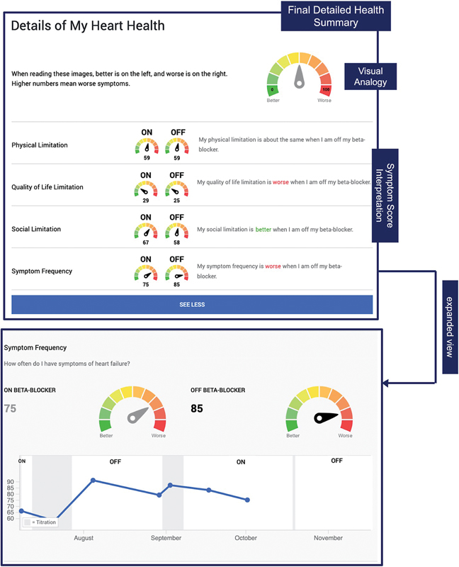
Visual Analogy
Participants reported a preference for a visual analogy (gauge) to see their results but also wanted text and numerical anchors to assist with interpretation. For example, one participant liked the gauge “as a way to represent numbers” but suggested that we “define the sections” of the gauge further by adding labels that indicate the direction of the change such as “better, much better, etcetera” (P4). In response, we added a gauge to the top of the “My Heart Health” section and the “My General Health” section with number anchors (0 and 100) and descriptors (better and worse) at each end of the gauge. This was intended to provide participants with a reference for interpreting the data.
Symptom Severity and Comparing Results
Participants did not understand the score interpretation text that used words to indicate severity (e.g., high, very high, low). Regarding their physical symptoms results, one participant asked: “How much does it limit my lifestyle—'high'? Does that mean 'a lot'?” (P1). In response, we changed the score interpretation text for the KCCQ-12 to “excellent, good, fair, or poor,” and for the PROMIS-29 to “normal, mild, moderate, or severe” which are the standardized descriptions of each level for these instruments.[32] [34]
Participants preferred to see an explicit interpretation of symptom comparison (e.g., better [at least 5-point decrease in symptom score from on to off β-blocker], worse [at least 5-point increase in symptom score from on to off β-blocker]) when viewing detailed symptom results. One participant, when asked to reflect on what they got out of the visualization, mentioned that seeing changes corroborated how they were feeling: “There were one or two things that had changed…You know, I felt better… That is [the main part] of what the results have showed.” (P5). One participant highlighted that seeing changes was important to them, saying that the visualization was “helpful, because it's astounding that I noticed … that [my shortness of breath] wasn't as bad” (P2). Since participants preferred to see their symptoms framed as a comparison, we removed the symptom severity interpretations (e.g., poor, fair, mild) and emphasized the comparison (e.g., better, worse). To emphasize comparison, we added comparison gauges depicting on versus off β-blocker to the standard view of individual symptoms and added red and green color-coding to the words “better” and “worse” in the text interpretation next to the gauges. To determine better or worse, we used a threshold of >0 for the KCCQ-12 and at least 5 for the PROMIS-29 domains. For the KCCQ-12, there are emerging data that even small changes in the KCCQ-12 can indicate clinically important changes.[42] For PROMIS-29, the developers state that a change of 5 points in the T-score (half a standard deviation) can be used as a benchmark.[43]
Final Model
The final three participants who participated in the trial and reviewed the iterated models shown in [Figs. 3] and [4] did not have any additional feedback regarding interface format, which indicated to the team that we approached design saturation. Some parts of the final tool were established earlier in the process because participants were satisfied with them. For example, in response to seeing the visual analogy with the reference image, one participant mentioned that “the gauge attracts your eyes and brain and makes it easier to understand” (P5). Participants appreciated seeing their symptom results in the final model, particularly those relating to mental health, and naturally linked the colors in the visual analogy to progress: “The chart at the end, how my psychological patterns might have changed … I wasn't that aware of it during the [surveys]. It's nice that the numbers came out green at the end.” (P7). Another participant mentioned that the interface “was a good way of summarizing everything … It was a good representation if you needed to get information out of it” (P9).
Discussion
In this study, we iterated on a data visualization tool that summarizes symptom results for N-of-1 medication trials, based on participant feedback. Key points that were subsequently incorporated into refinement of the data visualization tool included (1) participants preferred to see data for individual symptoms rather than summary scores, (2) participants appreciated a reference image with labels to help with interpretation of the visual analogy (gauge), and (3) participants preferred language that explicitly conveyed the results of the comparison between On and Off medication (e.g., better, worse) rather than language reflecting severity (e.g., severe, mild) that required the participant to compare effects on their own accord.
We found that participants preferred to see individual symptom scores rather than aggregate summary scores, which were overly abstract and did not necessarily map to how participants felt. Individual symptom scores allow participants to weigh selected symptoms over others in decision-making processes, which is important since participants may prioritize symptoms differently. This finding aligns with prior research that found that participants were less enthusiastic about seeing summarized health results, and instead preferred to see their tracking data of specific symptoms because summary data were too complicated to interpret using a graph.[22] Moreover, there may be scenarios where a summary score is unchanged but meaningful individual symptom scores differ. For these reasons, while summary scores may be beneficial in some settings (such as organizing and presenting quality measure results),[44] individual symptom scores may be optimal for sharing PROs.
Our findings indicate that priming participants with the gauge concept by posting a clearly labeled gauge at the top of each symptom section was important to maximize participant comprehensibility. Prior work has shown that analogies like gauges can help participants understand their own data.[9] This study now provides additional insights into specific details for the effective gauges as a means to display data, including using a reference image with explicit reference range and clear labels. In addition, it was not surprising that participants found it easier to interpret multiple gauges when they each had consistent directionality to indicate better and worse. In some cases (such as ours), this may require renaming or reverse coding of some PRO measures. While prior work has not shown consensus on how PRO result directionality should be portrayed, it is likely that the most important driving principle is consistency.[45] [46] Whether participants can more easily interpret side-by-side gauges or a single gauge with multiple superimposed readings is not known and may be worth studying in the future to maximize comprehensibility.
We also found that participants have a strong preference for seeing explicit qualitative comparisons of symptom severity, which may have implications for approaching shared decision-making in future work. Participants preferred easy-to-understand, interpretable phrases regarding their data. This is aligned with current recommendations that researchers when returning PROs, should explicitly convert data into meaningful qualitative text and information aids such as visualizations so that participants across a wide range of literacy and numeracy can understand the data.[38] [45] A prior study in N-of-1 trials had contrasting findings in that graphical comparisons of better/worse displaying differences between treatments were less helpful for decision-making.[22] Notably, however, some participants in that study suggested alternative displays to present their data, such as using an image or icon instead of a bar or line graph. Although PRO scales can provide additional precision for the measurement of how participants feel, many participants may prefer simple language like “better” and “worse” depending on the context, data type, and outcome of interest. Future tools may also benefit from including simple text accompanied by the option to see additional detail.
There were limitations to this study. We were limited in our sample size and the representativeness of our sample in terms of race, ethnicity, education, and health literacy. In this study, we only studied one specific condition (HFpEF)—future work is needed for a range of conditions to determine whether preferences differ across diseases. Based on existing design preferences research among participants with conditions such as HF, HIV, and asthma,[9] [10] [47] the preference for visual analogies to convey complex health results has been successful but this is worth further exploring in future work. Future work should also consider how results are framed and worded for ease of interpretation for lay audiences and include formal comprehension evaluations of the information provided. Due to the complexity of gold-standard PRO measurement tool calculations and interpretation, future research should also explore alternative ways to display results without obscuring the validity of the tool selected or work toward validating tools that have readily comprehensible results for participants with low health literacy and subjective numeracy levels. Lastly, future work can benefit from evaluating shared decision-making resources such as the present tool with clinicians for clinician adoption and shared communication outcomes, since prior work suggests that data visualization tools may reduce cognitive load, save time during clinical encounters, and promote decision-making.[48]
Conclusion
From this qualitative study related to iterating a data visualization tool for PRO symptoms to facilitate decision-making in N-of-1 trials, we found that participants preferred to see individual symptoms rather than in aggregate scores, appreciated a reference image with labels to help with the interpretation of the visual analogy (gauge), and preferred language that explicitly conveyed the results of the comparison between On and Off medication. These findings should be used to inform future participant-facing data visualization tools for PROs.
Clinical Relevance Statement
In our work, we found that HF patients had specific preferences for receiving their symptom data, such as viewing individual symptoms and focusing on what got better or worse. This finding can be particularly useful in facilitating time-limited medication discontinuation trials, where symptoms of a condition, such as HF, may overlap with the side effects of a medication. Clinicians may consider implementing similar web-based systems that utilize data visualizations to engage patients as active decision-makers about their health and medications.
Multiple-Choice Questions
-
What is an effective strategy to support participants' interpretation of data visualizations?
-
Provide participants with a disclaimer that the visualization may be confusing
-
Provide a labeled example image above the visualization
-
Give participants a separate written guide on how to interpret the visualization
-
Provide multiple alternative graphs for participants to use the one they interpret best
Correct Answer: The correct option is option b. In our work, we found that providing a labeled example image to participants helped with interpreting the data visualization by providing anchor numbers and labels on what would be a “better” versus “worse” score. Researchers should be cautious of providing too much text to participants or adding additional unnecessary steps to understanding their data.
-
-
What is the most effective format to return PRO information to patients/health research participants?
-
Text only
-
Number lines or line graphs
-
Visual analogies
-
Can be a combination. The format depends on the target audience's preferences for receiving health information.
Correct Answer: The correct answer is option d. While certain formats of receiving health information may be more effective than others in most circumstances (e.g., a visual analogy may be easier to understand than line graphs), researchers should work with their target audiences to learn their preferences for receiving health information and what formats are most conducive to comprehension.
-
Conflict of Interest
P.G. has received consulting fees from Sensorum Health and has received personal fees for medicolegal consulting related to HF.
Acknowledgments
We would like to acknowledge Lisa Grossman Liu for her efforts in designing the prototype interface, as well as Jessie Lee and Guilherme Ortiz for their help in iterating and refining the interface.
Protection of Human Subjects
The study was reviewed and approved by the Institutional Review Board at Weill Cornell Medicine.
-
References
- 1 Bell SK, Mejilla R, Anselmo M. et al. When doctors share visit notes with patients: a study of patient and doctor perceptions of documentation errors, safety opportunities and the patient-doctor relationship. BMJ Qual Saf 2017; 26 (04) 262-270
- 2 Open Notes. U.S. Federal Rules Mandates Open Notes. Accessed May 11, 2022 at: https://www.opennotes.org/onc-federal-rule/
- 3 HealthIT.gov. Information Blocking. Accessed April 18, 2022 at: https://www.healthit.gov/topic/information-blocking
- 4 Marzban S, Najafi M, Agolli A, Ashrafi E. Impact of patient engagement on healthcare quality: a scoping review. J Patient Exp 2022; 9: 23 743735221125439
- 5 Krist AH, Tong ST, Aycock RA, Longo DR. Engaging patients in decision-making and behavior change to promote prevention. Stud Health Technol Inform 2017; 240: 284-302
- 6 Pew. Most Americans Want to Share and Access More Digital Health Data. Accessed February 21, 2022 at: https://www.pewtrusts.org/en/research-and-analysis/issue-briefs/2021/07/most-americans-want-to-share-and-access-more-digital-health-data
- 7 Davidson KW, Mangione CM, Barry MJ. et al; US Preventive Services Task Force. Collaboration and shared decision-making between patients and clinicians in preventive health care decisions and US Preventive Services Task Force Recommendations. JAMA 2022; 327 (12) 1171-1176
- 8 Dennison Himmelfarb CR, Beckie TM, Allen LA. et al; American Heart Association Council on Cardiovascular and Stroke Nursing, American Heart Association Council on Cardiovascular and Stroke Nursing; Council on Clinical Cardiology; Council on Quality of Care and Outcomes Research; Council on Hypertension; Council on the Kidney in Cardiovascular Disease; Council on Lifelong Congenital Heart Disease and Heart Health in the Young; Council on Lifestyle and Cardiometabolic Health; Council on Peripheral Vascular Disease; Council on Epidemiology and Prevention; and Stroke Council. Shared decision-making and cardiovascular health: a scientific statement from the American Heart Association. Circulation 2023; 148 (11) 912-931
- 9 Reading Turchioe M, Grossman LV, Myers AC, Baik D, Goyal P, Masterson Creber RM. Visual analogies, not graphs, increase patients' comprehension of changes in their health status. J Am Med Inform Assoc 2020; 27 (05) 677-689
- 10 Arcia A, George M, Lor M, Mangal S, Bruzzese JM. Design and comprehension testing of tailored asthma control infographics for adults with persistent asthma. Appl Clin Inform 2019; 10 (04) 643-654
- 11 Stonbraker S, Halpern M, Bakken S, Schnall R. Developing infographics to facilitate HIV-related patient-provider communication in a limited-resource setting. Appl Clin Inform 2019; 10 (04) 597-609
- 12 Mangal S, Carter E, Arcia A. Developing an educational resource for parents on pediatric catheter-associated urinary tract infection (CAUTI) prevention. Am J Infect Control 2022; 50 (04) 400-408
- 13 Lor M, Koleck TA, Bakken S. Information visualizations of symptom information for patients and providers: a systematic review. J Am Med Inform Assoc 2019; 26 (02) 162-171
- 14 Turchioe MR, Myers A, Isaac S. et al. A systematic review of patient-facing visualizations of personal health data. Appl Clin Inform 2019; 10 (04) 751-770
- 15 Reading Turchioe M, Mangal S, Goyal P. et al. Special Section on Patient Engagement in Informatics: A RE-AIM evaluation of a visualization-based electronic patient-reported outcomes system. Appl Clin Inform 2023; 14: 227-237
- 16 Lillie EO, Patay B, Diamant J, Issell B, Topol EJ, Schork NJ. The n-of-1 clinical trial: the ultimate strategy for individualizing medicine?. Per Med 2011; 8 (02) 161-173
- 17 McDonald S, Nikles J. N-of-1 trials in healthcare. Healthcare (Basel) 2021; 9 (03) 330
- 18 Goyal P, Safford MM, Hilmer SN. et al. N-of-1 trials to facilitate evidence-based deprescribing: rationale and case study. Br J Clin Pharmacol 2022; 88 (10) 4460-4473
- 19 Agency for Healthcare Research and Quality. User Engagement, Training, and Support for Conducting N-of-1 Trials (Chapter 6). Accessed October 26, 2023 at: https://effectivehealthcare.ahrq.gov/products/n-1-trials/research
- 20 Vohra S, Shamseer L, Sampson M. et al; CENT Group. CONSORT extension for reporting N-of-1 trials (CENT) 2015 Statement. BMJ 2015; 350: h1738
- 21 Kravitz RL, Schmid CH, Marois M. et al. Effect of mobile device-supported single-patient multi-crossover trials on treatment of chronic musculoskeletal pain: a randomized clinical trial. JAMA Intern Med 2018; 178 (10) 1368-1377
- 22 Whitney RL, Ward DH, Marois MT, Schmid CH, Sim I, Kravitz RL. Patient perceptions of their own data in mHealth technology-enabled N-of-1 trials for chronic pain: qualitative study. JMIR Mhealth Uhealth 2018; 6 (10) e10291
- 23 Samuel JP, Wootton SH, Tyson JE. N-of-1 trials: the epitome of personalized medicine?. J Clin Transl Sci 2023; 7 (01) e161
- 24 Kronish IM, Cheung YK, Julian J. et al. Clinical usefulness of bright white light therapy for depressive symptoms in cancer survivors: results from a series of personalized (N-of-1) trials. Healthcare (Basel) 2019; 8 (01) 10
- 25 Marcus GM, Modrow MF, Schmid CH. et al. Individualized studies of triggers of paroxysmal atrial fibrillation: The I-STOP-AFib randomized clinical trial. JAMA Cardiol 2022; 7 (02) 167-174
- 26 Wirta SB, Balas B, Proenca CC. et al. Perceptions of heart failure symptoms, disease severity, treatment decision-making, and side effects by patients and cardiologists: a multinational survey in a cardiology setting. Ther Clin Risk Manag 2018; 14: 2265-2272
- 27 Alpert CM, Smith MA, Hummel SL, Hummel EK. Symptom burden in heart failure: assessment, impact on outcomes, and management. Heart Fail Rev 2017; 22 (01) 25-39
- 28 Weill Medical College of Cornell University. Pilot Deprescribing N-of-1 Trials for Beta-blockers in HFpEF. Accessed April 27, 2023 at: https://clinicaltrials.gov/ct2/show/NCT04757584
- 29 Chew LD, Bradley KA, Boyko EJ. Brief questions to identify patients with inadequate health literacy. Fam Med 2004; 36 (08) 588-594
- 30 McNaughton CD, Cavanaugh KL, Kripalani S, Rothman RL, Wallston KA. Validation of a short, 3-item version of the subjective numeracy scale. Med Decis Making 2015; 35 (08) 932-936
- 31 Okan Y, Janssen E, Galesic M, Waters EA. Using the short graph literacy scale to predict precursors of health behavior change. Med Decis Making 2019; 39 (03) 183-195
- 32 Green CP, Porter CB, Bresnahan DR, Spertus JA. Development and evaluation of the Kansas City Cardiomyopathy Questionnaire: a new health status measure for heart failure. J Am Coll Cardiol 2000; 35 (05) 1245-1255
- 33 Spertus JA, Jones PG. Development and validation of a short version of the Kansas City Cardiomyopathy Questionnaire. Circ Cardiovasc Qual Outcomes 2015; 8 (05) 469-476
- 34 National Institute on Aging. Patient-Reported Outcomes Measurement Information System (PROMIS). Accessed October 26, 2022 at: https://www.nia.nih.gov/research/resource/patient-reported-outcomes-measurement-information-system-promis
- 35 Sandhu AT, Zheng J, Kalwani NM. et al. Impact of patient-reported outcome measurement in heart failure clinic on clinician health status assessment and patient experience: a substudy of the PRO-HF Trial. Circ Heart Fail 2023; 16 (02) e010280
- 36 Masterson Creber R, Spadaccio C, Dimagli A, Myers A, Taylor B, Fremes S. Patient-reported outcomes in cardiovascular trials. Can J Cardiol 2021; 37 (09) 1340-1352
- 37 Reading Turchioe M, Grossman LV, Baik D. et al. Older adults can successfully monitor symptoms using an inclusively designed mobile application. J Am Geriatr Soc 2020; 68 (06) 1313-1318
- 38 Grossman LV, Feiner SK, Mitchell EG, Masterson Creber RM. Leveraging patient-reported outcomes using data visualization. Appl Clin Inform 2018; 9 (03) 565-575
- 39 Arcia A, Suero-Tejeda N, Spiegel-Gotsch N, Luchsinger JA, Mittelman M, Bakken S. Helping Hispanic family caregivers of persons with dementia “get the picture” about health status through tailored infographics. Gerontologist 2019; 59 (05) e479-e489
- 40 Assarroudi A, Heshmati Nabavi F, Armat MR, Ebadi A, Vaismoradi M. Directed qualitative content analysis: the description and elaboration of its underpinning methods and data analysis process. J Res Nurs 2018; 23 (01) 42-55
- 41 Spertus JA, Jones PG, Sandhu AT, Arnold SV. Interpreting the Kansas City Cardiomyopathy Questionnaire in Clinical Trials and Clinical Care: JACC State-of-the-Art Review. J Am Coll Cardiol 2020; 76 (20) 2379-2390
- 42 Butler J, Khan MS, Mori C. et al. Minimal clinically important difference in quality of life scores for patients with heart failure and reduced ejection fraction. Eur J Heart Fail 2020; 22 (06) 999-1005
- 43 Health Measures. Meaningful Change for PROMIS. Accessed December 20, 2023 at: https://www.healthmeasures.net/score-and-interpret/interpret-scores/promis/meaningful-change
- 44 Agency for Healthcare Research and Quality. Combining Quality Measures Into Composites. Accessed May 19, 2023 at: https://www.ahrq.gov/talkingquality/translate/organize/composites.html
- 45 Snyder C, Smith K, Holzner B, Rivera YM, Bantug E, Brundage M. PRO Data Presentation Delphi Panel. Making a picture worth a thousand numbers: recommendations for graphically displaying patient-reported outcomes data. Qual Life Res 2019; 28 (02) 345-356
- 46 Hohenstein JC, Baumer EP, Reynolds L. et al. Supporting accurate interpretation of self-administered medical test results for mobile health: assessment of design, demographics, and health condition. JMIR Hum Factors 2018; 5 (01) e9
- 47 Stonbraker S, Flynn G, George M. et al. Feasibility and acceptability of using information visualizations to improve HIV-related communication in a limited-resource setting: a short report. AIDS Care 2022; 34 (04) 535-541
- 48 Farri O, Rahman A, Monsen KA. et al. Impact of a prototype visualization tool for new information in EHR clinical documents. Appl Clin Inform 2012; 3 (04) 404-418
Address for correspondence
Publication History
Received: 16 January 2024
Accepted: 22 August 2024
Accepted Manuscript online:
23 August 2024
Article published online:
27 November 2024
© 2024. Thieme. All rights reserved.
Georg Thieme Verlag KG
Rüdigerstraße 14, 70469 Stuttgart, Germany
-
References
- 1 Bell SK, Mejilla R, Anselmo M. et al. When doctors share visit notes with patients: a study of patient and doctor perceptions of documentation errors, safety opportunities and the patient-doctor relationship. BMJ Qual Saf 2017; 26 (04) 262-270
- 2 Open Notes. U.S. Federal Rules Mandates Open Notes. Accessed May 11, 2022 at: https://www.opennotes.org/onc-federal-rule/
- 3 HealthIT.gov. Information Blocking. Accessed April 18, 2022 at: https://www.healthit.gov/topic/information-blocking
- 4 Marzban S, Najafi M, Agolli A, Ashrafi E. Impact of patient engagement on healthcare quality: a scoping review. J Patient Exp 2022; 9: 23 743735221125439
- 5 Krist AH, Tong ST, Aycock RA, Longo DR. Engaging patients in decision-making and behavior change to promote prevention. Stud Health Technol Inform 2017; 240: 284-302
- 6 Pew. Most Americans Want to Share and Access More Digital Health Data. Accessed February 21, 2022 at: https://www.pewtrusts.org/en/research-and-analysis/issue-briefs/2021/07/most-americans-want-to-share-and-access-more-digital-health-data
- 7 Davidson KW, Mangione CM, Barry MJ. et al; US Preventive Services Task Force. Collaboration and shared decision-making between patients and clinicians in preventive health care decisions and US Preventive Services Task Force Recommendations. JAMA 2022; 327 (12) 1171-1176
- 8 Dennison Himmelfarb CR, Beckie TM, Allen LA. et al; American Heart Association Council on Cardiovascular and Stroke Nursing, American Heart Association Council on Cardiovascular and Stroke Nursing; Council on Clinical Cardiology; Council on Quality of Care and Outcomes Research; Council on Hypertension; Council on the Kidney in Cardiovascular Disease; Council on Lifelong Congenital Heart Disease and Heart Health in the Young; Council on Lifestyle and Cardiometabolic Health; Council on Peripheral Vascular Disease; Council on Epidemiology and Prevention; and Stroke Council. Shared decision-making and cardiovascular health: a scientific statement from the American Heart Association. Circulation 2023; 148 (11) 912-931
- 9 Reading Turchioe M, Grossman LV, Myers AC, Baik D, Goyal P, Masterson Creber RM. Visual analogies, not graphs, increase patients' comprehension of changes in their health status. J Am Med Inform Assoc 2020; 27 (05) 677-689
- 10 Arcia A, George M, Lor M, Mangal S, Bruzzese JM. Design and comprehension testing of tailored asthma control infographics for adults with persistent asthma. Appl Clin Inform 2019; 10 (04) 643-654
- 11 Stonbraker S, Halpern M, Bakken S, Schnall R. Developing infographics to facilitate HIV-related patient-provider communication in a limited-resource setting. Appl Clin Inform 2019; 10 (04) 597-609
- 12 Mangal S, Carter E, Arcia A. Developing an educational resource for parents on pediatric catheter-associated urinary tract infection (CAUTI) prevention. Am J Infect Control 2022; 50 (04) 400-408
- 13 Lor M, Koleck TA, Bakken S. Information visualizations of symptom information for patients and providers: a systematic review. J Am Med Inform Assoc 2019; 26 (02) 162-171
- 14 Turchioe MR, Myers A, Isaac S. et al. A systematic review of patient-facing visualizations of personal health data. Appl Clin Inform 2019; 10 (04) 751-770
- 15 Reading Turchioe M, Mangal S, Goyal P. et al. Special Section on Patient Engagement in Informatics: A RE-AIM evaluation of a visualization-based electronic patient-reported outcomes system. Appl Clin Inform 2023; 14: 227-237
- 16 Lillie EO, Patay B, Diamant J, Issell B, Topol EJ, Schork NJ. The n-of-1 clinical trial: the ultimate strategy for individualizing medicine?. Per Med 2011; 8 (02) 161-173
- 17 McDonald S, Nikles J. N-of-1 trials in healthcare. Healthcare (Basel) 2021; 9 (03) 330
- 18 Goyal P, Safford MM, Hilmer SN. et al. N-of-1 trials to facilitate evidence-based deprescribing: rationale and case study. Br J Clin Pharmacol 2022; 88 (10) 4460-4473
- 19 Agency for Healthcare Research and Quality. User Engagement, Training, and Support for Conducting N-of-1 Trials (Chapter 6). Accessed October 26, 2023 at: https://effectivehealthcare.ahrq.gov/products/n-1-trials/research
- 20 Vohra S, Shamseer L, Sampson M. et al; CENT Group. CONSORT extension for reporting N-of-1 trials (CENT) 2015 Statement. BMJ 2015; 350: h1738
- 21 Kravitz RL, Schmid CH, Marois M. et al. Effect of mobile device-supported single-patient multi-crossover trials on treatment of chronic musculoskeletal pain: a randomized clinical trial. JAMA Intern Med 2018; 178 (10) 1368-1377
- 22 Whitney RL, Ward DH, Marois MT, Schmid CH, Sim I, Kravitz RL. Patient perceptions of their own data in mHealth technology-enabled N-of-1 trials for chronic pain: qualitative study. JMIR Mhealth Uhealth 2018; 6 (10) e10291
- 23 Samuel JP, Wootton SH, Tyson JE. N-of-1 trials: the epitome of personalized medicine?. J Clin Transl Sci 2023; 7 (01) e161
- 24 Kronish IM, Cheung YK, Julian J. et al. Clinical usefulness of bright white light therapy for depressive symptoms in cancer survivors: results from a series of personalized (N-of-1) trials. Healthcare (Basel) 2019; 8 (01) 10
- 25 Marcus GM, Modrow MF, Schmid CH. et al. Individualized studies of triggers of paroxysmal atrial fibrillation: The I-STOP-AFib randomized clinical trial. JAMA Cardiol 2022; 7 (02) 167-174
- 26 Wirta SB, Balas B, Proenca CC. et al. Perceptions of heart failure symptoms, disease severity, treatment decision-making, and side effects by patients and cardiologists: a multinational survey in a cardiology setting. Ther Clin Risk Manag 2018; 14: 2265-2272
- 27 Alpert CM, Smith MA, Hummel SL, Hummel EK. Symptom burden in heart failure: assessment, impact on outcomes, and management. Heart Fail Rev 2017; 22 (01) 25-39
- 28 Weill Medical College of Cornell University. Pilot Deprescribing N-of-1 Trials for Beta-blockers in HFpEF. Accessed April 27, 2023 at: https://clinicaltrials.gov/ct2/show/NCT04757584
- 29 Chew LD, Bradley KA, Boyko EJ. Brief questions to identify patients with inadequate health literacy. Fam Med 2004; 36 (08) 588-594
- 30 McNaughton CD, Cavanaugh KL, Kripalani S, Rothman RL, Wallston KA. Validation of a short, 3-item version of the subjective numeracy scale. Med Decis Making 2015; 35 (08) 932-936
- 31 Okan Y, Janssen E, Galesic M, Waters EA. Using the short graph literacy scale to predict precursors of health behavior change. Med Decis Making 2019; 39 (03) 183-195
- 32 Green CP, Porter CB, Bresnahan DR, Spertus JA. Development and evaluation of the Kansas City Cardiomyopathy Questionnaire: a new health status measure for heart failure. J Am Coll Cardiol 2000; 35 (05) 1245-1255
- 33 Spertus JA, Jones PG. Development and validation of a short version of the Kansas City Cardiomyopathy Questionnaire. Circ Cardiovasc Qual Outcomes 2015; 8 (05) 469-476
- 34 National Institute on Aging. Patient-Reported Outcomes Measurement Information System (PROMIS). Accessed October 26, 2022 at: https://www.nia.nih.gov/research/resource/patient-reported-outcomes-measurement-information-system-promis
- 35 Sandhu AT, Zheng J, Kalwani NM. et al. Impact of patient-reported outcome measurement in heart failure clinic on clinician health status assessment and patient experience: a substudy of the PRO-HF Trial. Circ Heart Fail 2023; 16 (02) e010280
- 36 Masterson Creber R, Spadaccio C, Dimagli A, Myers A, Taylor B, Fremes S. Patient-reported outcomes in cardiovascular trials. Can J Cardiol 2021; 37 (09) 1340-1352
- 37 Reading Turchioe M, Grossman LV, Baik D. et al. Older adults can successfully monitor symptoms using an inclusively designed mobile application. J Am Geriatr Soc 2020; 68 (06) 1313-1318
- 38 Grossman LV, Feiner SK, Mitchell EG, Masterson Creber RM. Leveraging patient-reported outcomes using data visualization. Appl Clin Inform 2018; 9 (03) 565-575
- 39 Arcia A, Suero-Tejeda N, Spiegel-Gotsch N, Luchsinger JA, Mittelman M, Bakken S. Helping Hispanic family caregivers of persons with dementia “get the picture” about health status through tailored infographics. Gerontologist 2019; 59 (05) e479-e489
- 40 Assarroudi A, Heshmati Nabavi F, Armat MR, Ebadi A, Vaismoradi M. Directed qualitative content analysis: the description and elaboration of its underpinning methods and data analysis process. J Res Nurs 2018; 23 (01) 42-55
- 41 Spertus JA, Jones PG, Sandhu AT, Arnold SV. Interpreting the Kansas City Cardiomyopathy Questionnaire in Clinical Trials and Clinical Care: JACC State-of-the-Art Review. J Am Coll Cardiol 2020; 76 (20) 2379-2390
- 42 Butler J, Khan MS, Mori C. et al. Minimal clinically important difference in quality of life scores for patients with heart failure and reduced ejection fraction. Eur J Heart Fail 2020; 22 (06) 999-1005
- 43 Health Measures. Meaningful Change for PROMIS. Accessed December 20, 2023 at: https://www.healthmeasures.net/score-and-interpret/interpret-scores/promis/meaningful-change
- 44 Agency for Healthcare Research and Quality. Combining Quality Measures Into Composites. Accessed May 19, 2023 at: https://www.ahrq.gov/talkingquality/translate/organize/composites.html
- 45 Snyder C, Smith K, Holzner B, Rivera YM, Bantug E, Brundage M. PRO Data Presentation Delphi Panel. Making a picture worth a thousand numbers: recommendations for graphically displaying patient-reported outcomes data. Qual Life Res 2019; 28 (02) 345-356
- 46 Hohenstein JC, Baumer EP, Reynolds L. et al. Supporting accurate interpretation of self-administered medical test results for mobile health: assessment of design, demographics, and health condition. JMIR Hum Factors 2018; 5 (01) e9
- 47 Stonbraker S, Flynn G, George M. et al. Feasibility and acceptability of using information visualizations to improve HIV-related communication in a limited-resource setting: a short report. AIDS Care 2022; 34 (04) 535-541
- 48 Farri O, Rahman A, Monsen KA. et al. Impact of a prototype visualization tool for new information in EHR clinical documents. Appl Clin Inform 2012; 3 (04) 404-418